Dashboard for Targeting Competitive House Races in Minnesota
One of the biggest challenges facing any successful political group from the DNC to your favorite issue organization, is figuring out which elections you should put your resources towards. Usually this has involved a mind-numbing number of spreadsheets and unreliable, messy data to figure out which races are the ones where your resources will be best used (usually closest based on past election results.
My goal was to build a tool that I wish I'd back when I was a State Data Manager, an interactive dashboard to sort through historic data to find the most competitive districts for the next election. This dashboard displays past election results in interactive charts that filter the data displayed.
You can drag and select parts of any of the charts filtering the data to only show you districts that meet your criteria. For example, to pick districts where the DFL candidate got between 45% and 50% of the vote, you first click on the middle chart at 45 on the X-axis and then drag the cursor to 50. This filters the results on the whole page to only those districts.
While interactive data tools such as Tableau have become more common, the high cost (both monetary and technical) are a huge barrier to many organizations. I built this dashboard using only open source tools including javascript, d3.js, dc.js, and HTML. It is a single page application that can be run on any webserver at a (very) low cost. My hope is that this type of dashboard can easily be used to make better decisions using data. This demo version has data from the 2014 Minnesota State House elections but this could be updated with any office, state and/or year.
The live version is hosted here.
What are all these charts?
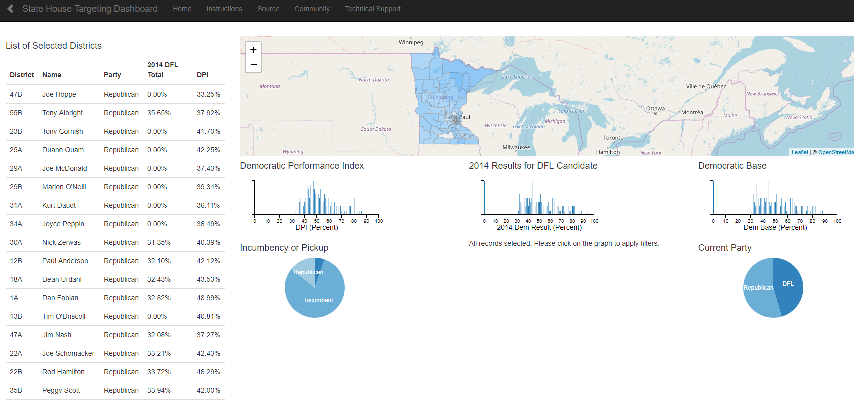
Starting at the top, the map is color coded by the Democratic Base* for each house district. It pans and zooms and has some basic information about each district in the popups (available by clicking). On the left side is a list of districts that meet the criteria you have selected on the other charts. It defaults to all districts until you filter using the other charts.
Below that are three histograms showing the Democratic Performance Index** (DPI), 2014 DFL Candidate State House Result, and Democratic Base respectively. Basically, the height of each bar shows the number of districts that percentage. Using DPI for example, if you look along the x-axis at 50%, the height of the bar tells you how many districts had a DPI of 50%.
Below these three charts, are two pie charts. The first one shows whether the incumbent kept their seat or else which party won. The second pie chart shows which party currently holds each seat. Both of these charts are interactive and also filter the data like the above charts.
The charts can be used together to help create complex queries without having to write any code. For example, you could look for districts held by incumbent Republicans who received between 45% and 50% of the vote in a distric with a DPI above 50%. After using the charts to filter the data, the table on the left edge would list the districts matching your criteria.
Feel free to play around with the dashboard, the data cannot be overwritten by the charts. Plus, you can always click the reset button in the center of the page to reset all of the chart filters to try new combinations of filters.
Next Steps
-
Update the data for 2016 results
-
Move the single-page app into a web app using Flask or Django.
-
Fix an issue in the dem base calculations where it lists 0% for uncontested races and instead use the second-lowest democratic candidate results.
-
Update to use database storage for the election stats rather than reading from a file.
*Dem Base/Democratic Base is the average percentage of votes received by the worst performing democratic candidate from each of the past three general elections.
** DPI is the average percentage of votes received by democratic candidates over the past three general elections.
Comments
comments powered by Disqus