Build an Election Results Explorer with Leaflet and R
Now with more popups
Overview
As I have said before, everybody loves seeing data on a map. Making those maps into an interactive app (with popups, layer selection, etc) can seem like sorcery to most people. Much like mice with cookies, making one data driven map begets more requests to create maps. Rather than bury ourselves in individual maps, we can layer on additional information and make it interactive so users can decide what information to focus on. Computerworld has a great tutorial that showed me the basics on map making and Leaflet layers here. In this post, I will take the election statistics data from an earlier post and put it on a map with popups and layers to allow us to explore election statistics for MN House Districts. A live preview is available here and github repo is here.
System Setup
This tutorial will use R and RStudio. RStudio is a development environment for R and I highly recommend having installed before following along. We will be using a several R packages but mainly tmap, leafletr, and htmlwidget. The leafletr package has a few additional features compared to Folium which I used earlier to link Leaflet with Python. Having RStudio will be especially helpful when using Leaflet because it will render the maps without needing a separate development server( or other weird workarounds). I developed the code for this tutorial using an R script but you could also use an R Markdown document or a Jupyter notebook.
library('tmap')
library('leaflet')
library('magrittr')
library('rio')
library('plyr')
library('scales')
library('htmlwidgets')
Get the map and data
Our next step is to import our election stats and then find a map of the state house districts. In the main project folder, I made a folder "data" for raw data. I copied a csv of our election statistics from earlier into that folder. Next, I used the rio package to read it into an R object.
datafile <- "data/election.csv"
election <- rio::import(datafile)
election$Pickup <- as.factor(election$Pickup)
str(election)
The first two lines read in the csv to the election dataframe. The third line transforms the "Pickup" column from text to a factor for easier mapping later. The final line displays a summary of column types in the dataframe. Next, I downloaded a map from Census Bureau's Cartographic Boundary page. I extracted the zipfile into the data folder and then used tmap to read it into R using the code below.
mnshape <- "data/cb_2015_27_sldl_500k.shp"
mngeo2 <- read_shape(file=mnshape)
qtm(mngeo2)
The "qtm" command is a really convenient function from tmap to display a shapefile. I can also use that command later to quickly create static maps of the election data. Speaking of election data, let's add that to the shape file and create an initial map. This lets us see how the district name is formatted so we can format it to join with the dataframe.
str(mngeo@data$NAME)
Unfortunately the district names are stored as factors (aka categories) and their format does not quite match with the format in the dataframe. I will need to recode the dataframe to match district names like "1A" to "01A" and also change the map data names into a text field. The following code accomplishes both tasks.
election$District <- revalue(election$District,
      c("1A"="01A", "1B"="01B","2A"="02A", "2B"= "02B", "3A"="03A", "3B"= "03B",
        "4A"="04A", "4B"="04B", "5A"="05A", "5B"="05B", "6A"="06A", "6B"="06B",
        "7A"="07A", "7B"="07B", "8A"="08A", "8B"="08B", "9A"="09A", "9B"="09B"))

mngeo@data$DISTRICT <- as.character(mngeo@data$NAME)
Now that the data is wrangled, it can be joined to the maps. This is usually the toughest part of mapping. Luckily, tmap has another helper function to make this process much easier.
mnmap <- append_data(mngeo, election, key.shp = "NAME", key.data="District")
The append_data() function takes the shapefile ("mngeo") and the dataframe ("election") along with which keys to use to join the files together. Since I took care of the reformatting and recoding earlier, the files match up. Now that the shapefile is complete, it is time to make some maps.
Maps!
As with most data projects, a bulk of the work was in finding and wrangling the data. With that step out of the way, we can make some maps. Again, tmap comes to the rescue with the qtm() function which creates a choropleth map quickly.
qtm(mnmap, "DemBase")
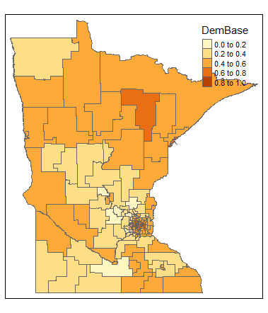
The above code snippet created the choropleth map using the values from "DemBase" in the combined shapefile. The qtm function can be a really useful way to quickly create static maps while exploring data. The qtm function has a lot of tools and customization options. Check out the tmap documentation.
Leaflet Maps
The part we've all been waiting for, making interactive maps with leaflet. With the additional functionality of Leaflet comes a litle bit more work. The first step will be to get the palette ready and then add the popups. Once we have these pieces, we can combine them into our map.
minPct <- min(c(mnmap@data$MNLEGPERC2014, mnmap@data$MNGOVPERC2014, mnmap@data$DPI, mnmap@data$DemBase))
maxPct <- max(c(mnmap@data$MNLEGPERC2014, mnmap@data$MNGOVPERC2014, mnmap@data$DPI, mnmap@data$DemBase))
paletteLayers <- colorBin(palette = "RdBu", domain = c(minPct, maxPct), bins = c(0, .4, .45, .5, .55, .6, 1) , pretty=FALSE)
I have taken a different approach to this palette in order to use it for multiple metrics. First I took the minimum and maximum values across all of the fields I will map and then used them to set the range for the palette. In the last line, I also added the bins that I wanted to see different breaks at. The "pretty = FALSE" call is to ensure it uses the actual ranges rather than allowing Leaflet to adjust the ranges to have even coverage.
Next up is setting the popups. The below code sets up the popups that will appear whenever you click on a district.
mnpopup <- paste0("<b>","District: ","</b>", mnmap@data$DISTRICT, "<br>",
              "<b>", "Representative: ", "</b>", mnmap@data$Name, "<br>",
              "<b>", "Party: ", "</b>", mnmap@data$Party, "<br>",
              "<b>","DFL House 2014: ","</b>", percent(mnmap@data$MNLEGPERC2014), "<br>",
              "<b>", "Pickup: ", "</b>", mnmap@data$Pickup, "<br>",
              "<b>","DPI: ","</b>", percent(mnmap@data$DPI), "<br>",
              "<b>","Dem Base: ","</b>", percent(mnmap@data$DemBase))
The Leaflet package understands raw HTML so I use paste0() to string together heading as a text field and then call the data directly as in the first line. "mnmap@data$District" directly access the data for the selected district from that field in the shapefile. Also, Leaflet will render the html tags I have added to bold the heading names and "
" to add a line break. I found that my popups behaved unpredictably without the linebreaks, but they may not be necessary. Additionally, I make use of the scales package with the percent() function. This converts decimals into a more readable format.
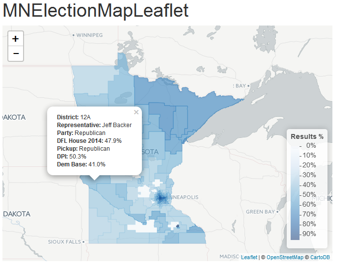
With everything set up, I will actually make a couple of maps. First I will create a single-layer map that is automatically rendered in RStudio. The second example will be a multi-layered map where you can select what data is displayed in the map. That map will be created as an object that can be exported to HTML for use on any website. The code for the first map is below.
leaflet(mngeo) %>%
addProviderTiles("CartoDB.Positron") %>%
addPolygons(stroke=TRUE,
          smoothFactor = 0.2,
          weight = 1,
          fillOpacity = .6,
          popup=mnpopup,
          color= ~mnPalette(mnmap@data$MNLEGPERC2014)
          )%>% addLegend("bottomright", pal = mnPalette, values = ~mnmap@data$MNLEGPERC2014, title = "Results %",
                         labFormat = labelFormat(suffix = '%', between = '% - ',
                                                 transform = function(x) 100 * x))
There is a lot of code here, but it follows a pretty straightforward pattern. The first line, "leaflet(mngeo) %>% " calls leaflet and tells it to use our mngeo shapefile. The "%>%" is a pipe operator (from the magrittr package) that sends the shape file info to the rest of the code. Provider tiles are the maps that are underneath the choropleth later, I used "CartoDB.Positron" but there are a lot of other options you could use (learn more here). The next three lines cover aesthetic choices about how shapes are drawn and you can find the details here. I found the values through trial and error, but seem to be very versatile. Next, I assign the popup info from earlier and then assign the color palette from before. The addLegend()) does what the name says, but the labFormat() function can be trickier. This function has a lot of options for how to display the numbers in the legend. This code appends "%" to end of the line (behind the last number), and puts "% - " in between each of the numbers. The final line in labelFormat() converts the decimals to display as regular numbers. The end result is shown in the snapshot below.
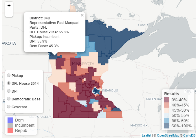
Finally, I will create a multi-layer map with popups where you can select what data is being displayed (hence the multiple layers). The basic structure will be to create a leaflet object with the shapefile and then add polygon layers to that object (one for each of the stats we want to be able to view) and finally add controls to select the layers. It sounds clunky, but is actually pretty straightforward once you see the code. Since we already have the palette layer and popups ready, I just need to create one new palette and then build the map.
incumbPalette <- colorFactor(palette = c("blue", "grey", "red"), domain = mnmap@data$Pickup)
The "Pickup" column in the election data tells us whether the seat was one by an incumbent, Republican, or DLF'er. The above code sets the color based on categorical information. Through trial and error, I found the order of the colors does matter. With that palette ready, let's build the initial object and one layer of the map.
mnResultmap <- leaflet(mngeo2) %>%
  addProviderTiles("CartoDB.Positron") %>%
  addPolygons(stroke=TRUE,
          weight=1,
          smoothFactor = 0.2,
          fillOpacity = .75,
          popup=mnpopup,
          color= ~incumbPalette(mnmap@data$Pickup),
          group="Pickup"
  ) %>%
  addLegend(position="bottomleft", colors=c('blue', 'grey', 'red'), labels=c("Dem", "Incumbent", "Repub"))
With that first layer, I used essentially the same code as when creating the standalone leaflet map earlier. To get the multiple layers, I will add "%>%" to chain it to the next layer on the map. After the last layer, I will add a call to the layer controls. After that, I just need to type the object name, "mnResultmap" and RStudio will serve a local version of the website. The full code for the map is below.
mnResultmap <- leaflet(mngeo2) %>%
  addProviderTiles("CartoDB.Positron") %>%
  addPolygons(stroke=TRUE,
          weight=1,
          smoothFactor = 0.2,
          fillOpacity = .75,
          popup=mnpopup,
          color= ~incumbPalette(mnmap@data$Pickup),
          group="Pickup"
  ) %>%
  addLegend(position="bottomleft", colors=c('blue', 'grey', 'red'), labels=c("Dem", "Incumbent", "Repub"))  %>%

  addPolygons(stroke=TRUE,
          weight=1,
          smoothFactor = 0.2,
          fillOpacity = .75,
          popup=mnpopup,
          color= ~paletteLayers(mnmap@data$MNLEGPERC2014),
          group="DFL House 2014"
  ) %>% addLegend("bottomright", pal = paletteLayers, values = ~mnmap@data$MNLEGPERC2014, title = "Results",
              labFormat = labelFormat(suffix = '%', between = '%-',
                                      transform = function(x) 100 * x)) %>%

  addPolygons(stroke=TRUE,
          weight=1,
          smoothFactor = 0.2,
          fillOpacity = .75,
          popup=mnpopup,
          color= ~paletteLayers(mnmap@data$DPI),
          group="DPI"
  ) %>%

  addPolygons(stroke=TRUE,
          weight=1,
          smoothFactor = 0.2,
          fillOpacity = .75,
          popup=mnpopup,
          color= ~paletteLayers(mnmap@data$DemBase),
          group="Democratic Base"
  ) %>%

  addPolygons(stroke=TRUE,
          weight=1,
          smoothFactor = 0.2,
          fillOpacity = .75,
          popup=mnpopup,
          color= ~paletteLayers(mnmap@data$MNGOVPERC2014),
          group="Governor"
  ) %>%

  addLayersControl(
    baseGroups=c("Pickup", "DFL House 2014", "DPI", "Democratic Base", "Governor"),
    position = "bottomleft",
    options = layersControlOptions(collapsed = FALSE)
  )

mnResultmap
Interactive version here
Now that I have the map working locally, I can export it with the htmlwidgets package.
saveWidget(mnResultmap, file="index.html")
This creates a single HTML file for use on any server (or in a Github Gist). Be warned, the HTML file is big and includes all of the data for the shape file and csv inline. This can make it really hard to modify the HTML, but it does work without any modification. Alternately, you can use RMarkdown and follow the instructions on this Stack Overflow post.
Having an interactive map can be a great tool for understanding complex data like this. Enjoy!
Comments
comments powered by Disqus